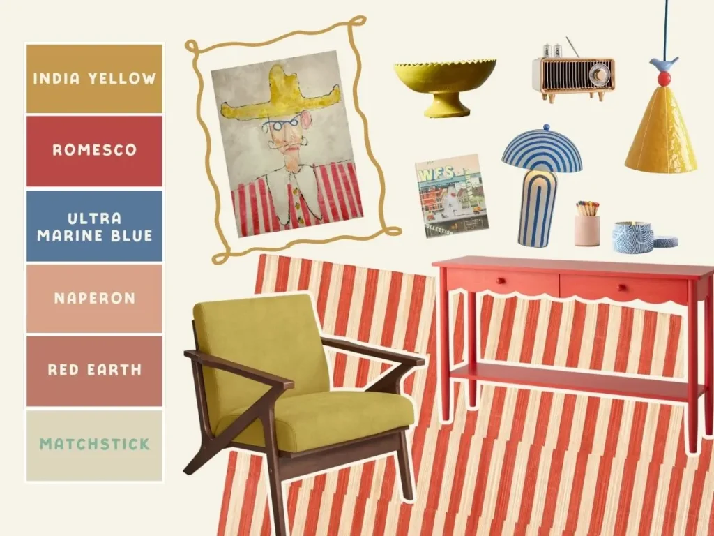
I fell in love with this Man In The Yellow Hat print and immediately started imagining how I’d style it. It’s by someone far too cool to actually be my friend but gosh I like bothering her on Instagram — check her out! Rosie Madison of Harrogate House Interiors.
You can get Rosie’s prints in a variety of sizes. I went with the A2 for the Man In The Yellow Hat and used this frame in the walnut color. I also think it would look incredible in a frame painted with India Yellow — it would tie the whole thing together so beautifully.

I love using a single artwork to inspire a whole space, and I wrote up the process here in case you want to try it yourself. I also have a guide on how to use Canva to build a color palette. Creating palettes became my secret weapon for decorating — it’s what finally made design click for me.
If you’ve been feeling stuck with your interiors, try this method: start with a piece of art you love, build your color palette from it, and shop within those colors. It’s honestly a game changer.
Wondering how I create color palettes based on a piece of decor? Here’s my guide for building a color palette on Canva!
How I’d Style The Man In The Yellow Hat
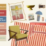
Now for the fun part — pulling it all together! Below you’ll find everything I’d use to style a room around this print, from paint colors to furniture and those little touches that make it feel collected and personal. Think: playful color, warm woods, and just enough whimsy to keep it interesting.

Let’s Chat Paint Colors
I used the artwork to guide my paint selections from Farrow & Ball — pulling out the key colors and finding shades that matched the mood of the piece. It’s an easy way to make sure the whole space feels connected without being too “matchy.”


Wondering why I always use Farrow & Ball?
There are a few reasons I love their paint — but one of the biggest is their sample pots.
The samples use the exact same formula as the full-size cans (which isn’t true for every paint brand). That means I can grab a few pots and add colorful accents around the house without spending a ton.
I use this trick all the time — painting picture frames, lamp bases, vases — anywhere a little hit of color can make a difference.
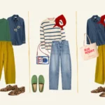
And Here’s How I’d Style The Art…
Inspired by the colors in the artwork, I pulled together a few pieces that capture the same playful, collected vibe. Think of these as a starting point — your muse for the space!
My best advice when designing with a color palette? Treat each color individually. Find a piece or two that highlights the first color, then move on to the second, and so on — layering them until the room feels happy, balanced, and cohesive. And of course you get bonus points if a piece features several colors.
PS Try not to bring in too many extra colors if you are going for a pulled together look. At some point it stops looking intentional.