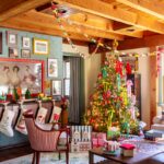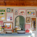
meet: the dining room
We recently had the hardwood floors refinished in our dining room and used it as an opportunity to give the space a bit of a refresh.
The centerpiece? The Schoolhouse Forma table and coordinating chairs. We fell in love with the persimmon color and are overjoyed to have it in the space!
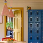
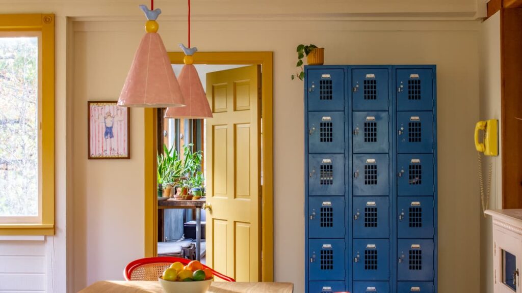
The dining room truly came together when a blue vintage locker—discovered serendipitously at an antique shop—was added, perfectly tying the look together a few months later.

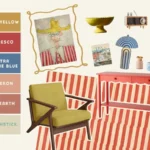
Paint Colors Used
My design strategy always centers around one core color palette that flows through the entire downstairs area. I weave these colors into the space by painting surfaces or through carefully chosen decorative accents.

I balance bold applications, such as painting furniture, with small touches, like a colorful vase, ensuring every hue makes an appearance. Art is really helpful in bringing several colors from your palette together.
This method helps ties the whole home together with a unified aesthetic.
Below I’ve shared the colors that I started with and how they are applied in the space. For the most part I used the exact shades, except for when it came to the vintage blue locker in the dining room. It’s way more electric than Oval Room Blue! But I couldn’t resist it– it adds such a fun pop to the space.


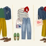
sources
Here are links for everything I could gather! A few pieces don’t have direct links, but I’ve made sure to source similar options for what I could.