
The Twin Bedroom
Truly the most charming room in our house, and the one that took the longest to get started.
My vision for this room formed when our youngest son was still in a crib, but between life and other projects it took another year or two before anything actually changed.
White walls, no art. The life of a second child!
The wallpaper is what finally got things moving– and once it went up, the whole room clicked into place almost immediately.
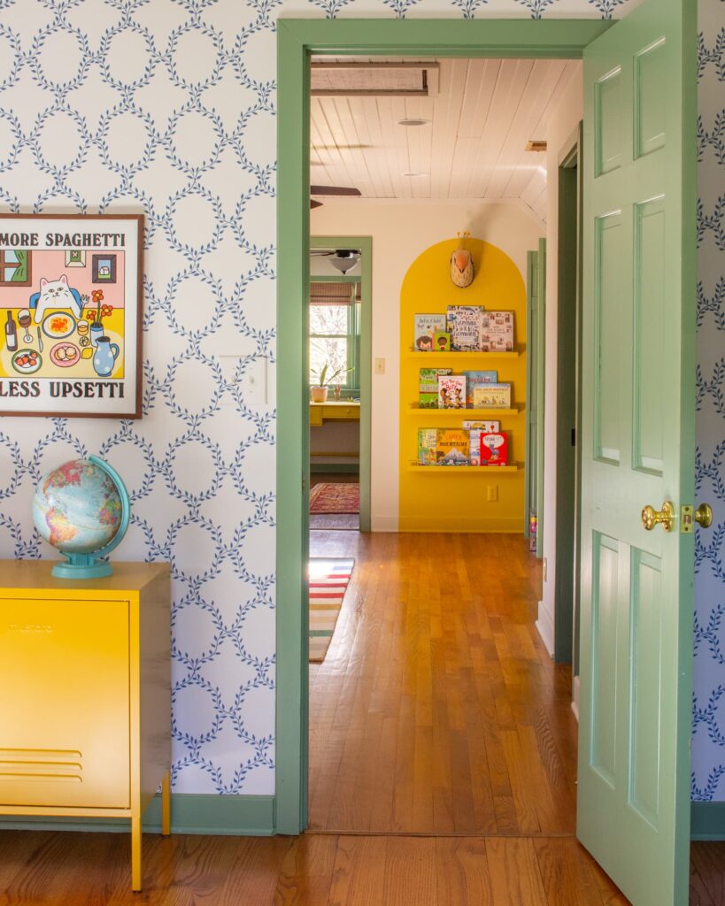
The palette is the same one we use throughout the upstairs: Breakfast Room Green trim, Romesco on the beds, Babouche and Stone Blue woven through in objects and art.
Joyful, collected, a little bit silly. Exactly right.
My favorite part of the room isn’t something I bought– it’s the antique telephone cabinet between the beds. It’s a family heirloom from Alex’s side and it makes the whole space.
I’m excited to show you around!
Twin Bedroom Details
Wallpaper & Paint
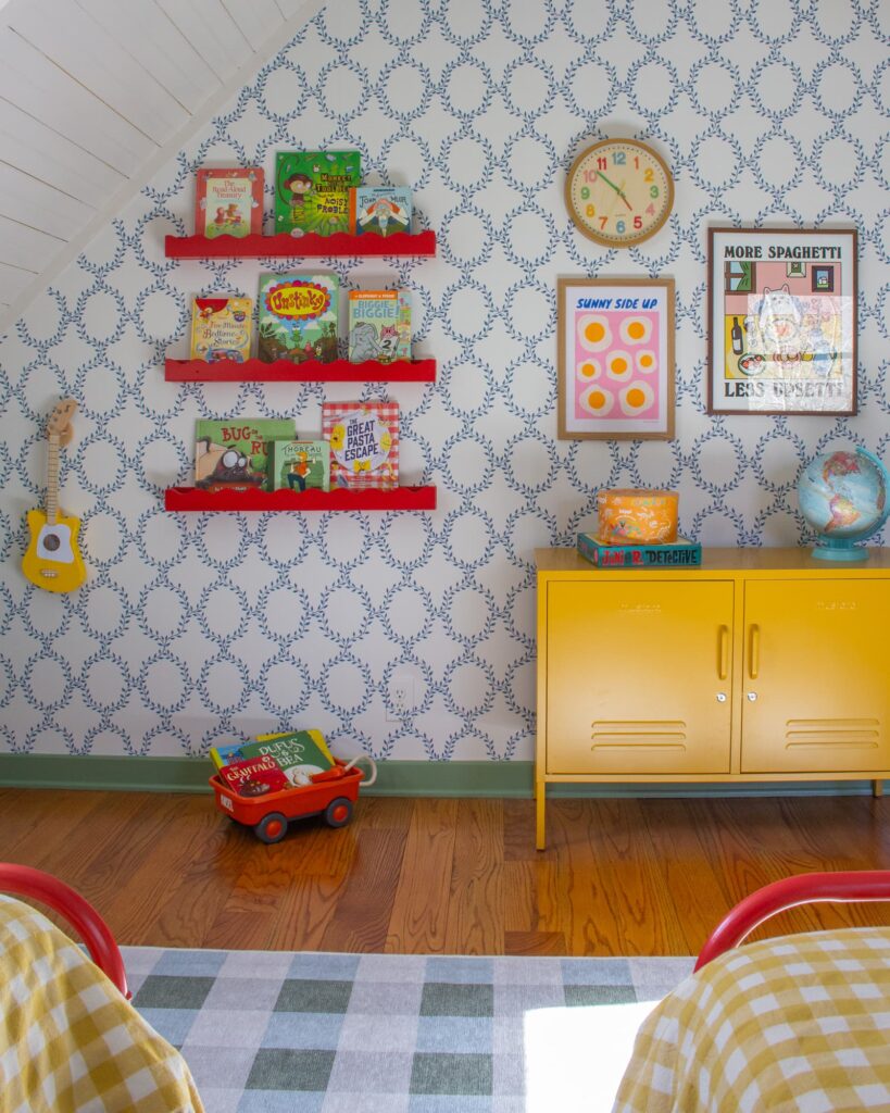
The wallpaper is by Sandberg Wallpaper. It’s the Wilma pattern in blue, and it completely transformed the space.
The trim is Breakfast Room Green and the beds are painted in Romesco, both in modern eggshell sheen.
The Art
The prints above each bed are from Prints by Ka– apple and pear, both in the 30x40cm size. I used 12×16 walnut frames which are a perfect fit for that print size.
The Sunny Side Up and More Spaghetti prints are both from Etsy.
The Sconces
The sconces by the bed are by Pooky Lighting (antique brass sconce with the ocean tapered shade.) We use rechargeable bulbs instead of hardwiring them– that’s it, no electrician required!
The Clock
Oh, how everyone loves this clock! It’s great! Not only is it cute, but it’s silent. My advice: take off the clear plastic cover before you hang it. You’ll see small screws on the back that will do the trick.

The Color Palette
The upstairs palette is brighter and bolder than downstairs — more saturated, more playful, turned all the way up. This room uses the same colors that run through the playroom and bathroom upstairs, so everything feels connected room to room.


Yellow Locker
The yellow locker is from Mustard Made and it’s our son’s absolute favorite piece of furniture. It comes with its own keys and he takes the job of locking up his treasures very seriously.
The Red Table Lamp
The red zigzag lamp is from West Elm and it’s such a fun piece! They also have a taller floor version.
Red Shelves
My husband made these out of scrap wood and we painted them with Romesco. These are similar.
The Beds
The metal twin bed frames were coated black from the factory and we subsequently painted them with Romesco — similar linked here. The gingham duvet covers are Heather Taylor Home in Sunflower and the construction-themed sheets are from Crate & Barrel.
The Phone Cabinet
It’s a family heirloom on Alex’s side and my favorite part of the room! Search ‘antique telephone cabinet‘ for similar pieces.
The Rug
It’s from the Home Edit collab with Ruggable but is no longer available. The color is Sutton Moss Green.


A Note On The Bed Frames
The bed frames started as black metal and we painted them ourselves with Romesco in modern eggshell finish.
It’s one of those things that sounds more complicated than it is– a coat of primer, a few coats of paint, and you have a custom colored bed for the cost of a small can of paint. The 750ml can was more than enough to paint the two bed frames.