So, you’re dreaming of a colorful home, but you’re a little unsure how to pull it off without overwhelming the senses. I’ve been there!
It’s a valid concern– there’s a fine line between a tastefully colorful home and one that feels a bit, well, chaotic.
I’ve spent a lot of time thinking about my approach and how I got to this point – comfortable adding color, knowing just where to commit, and, perhaps most importantly, understanding where to hold back.
And what’s my secret? It all comes down to strategic pops and clever placement.
I know, I know. Easier said than done! But I do think there are tips and tricks that will help you wrap your head around it.
Below I share a few of my favorite ways to introduce color into your home without overdoing it.
Start With A few Colors
I genuinely believe that starting with a clear color palette sets you up for decorating success. My own home didn’t start to feel cohesive until I decided on a few colors I absolutely adored and began strategically weaving them throughout the house.
In our house, we actually have two different color palettes. Downstairs, in the kitchen, living room, and dining room, we’ve got a more “grown-up” vibe going on. But head upstairs to the kids’ area, and you’ll find a much brighter, more playful palette.
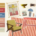
Downstairs Color Palette


Upstairs Color Palette


Notice how one is a bit brighter? The downstairs space still has plenty of color, but it’s less vibrant.
Tips For Picking interior Colors
If you’re aiming for that sophisticated, “grown-up” look, here’s a good tip: try to steer clear of primary colors in their purest, super-bright forms.
Think more nuanced shades instead of straight-up fire engine red or bright sunshine yellow.
Another piece of advice: go for saturated but not “loud” colors.
It’s easy to assume you need to pick the brightest possible shade if you want to truly add color.
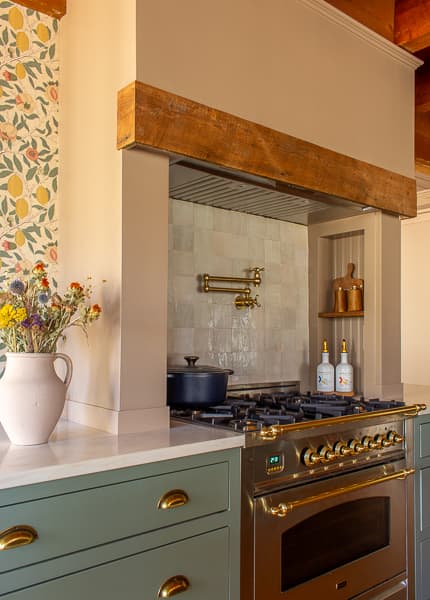
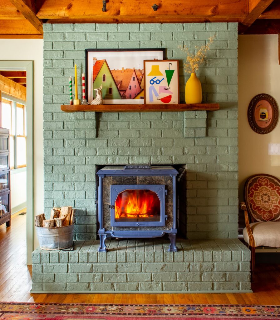
But honestly, it always surprises me how dark my go-to shade, Card Room Green, looks on a tiny color card. Yet, once it’s on the wall, it’s absolutely perfect! It adds so much richness without screaming for attention.
Below are two examples of Card Room Green in our house, seen on both the fireplace brick and the kitchen cabinets.

And here’s a little secret: the richness of a color often comes down to the quality of the paint itself. For example, did you know that Farrow & Ball uses over 30% more pigment than the industry standard? That’s why their paint colors are so incredibly beautiful and have such depth!
Want to dive deeper into choosing your own home color palette? Check out this article on our home palette— it includes tips to help you build yours.
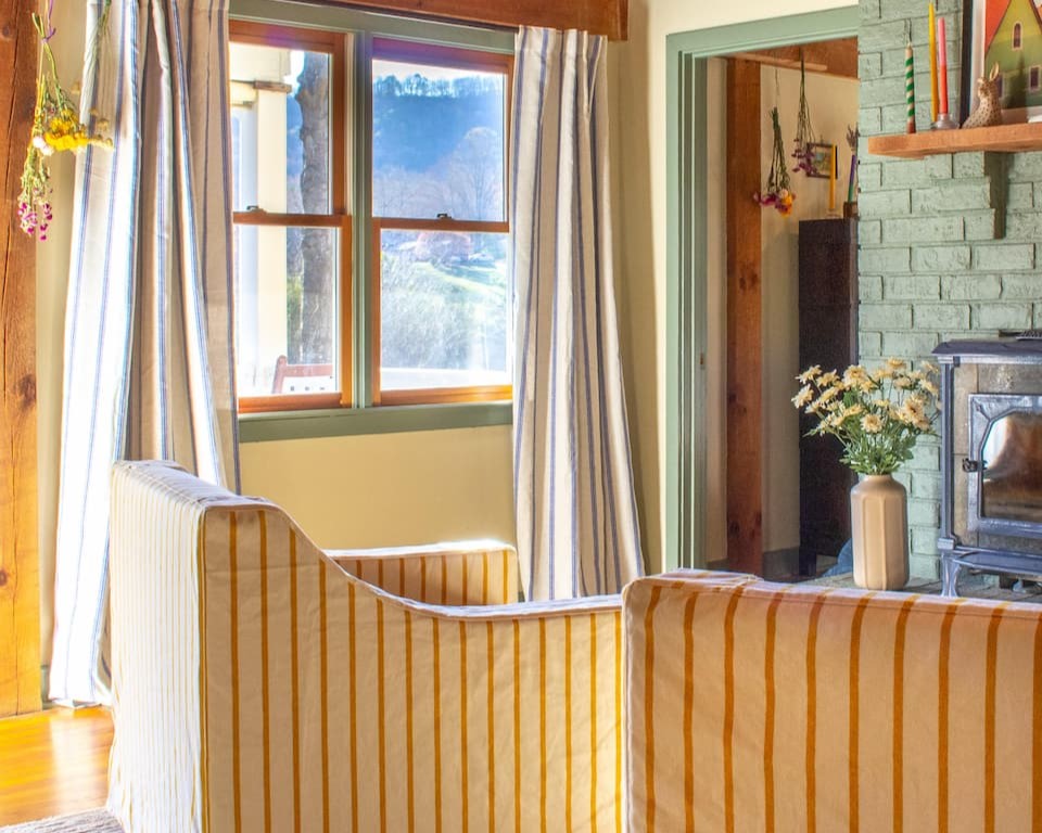
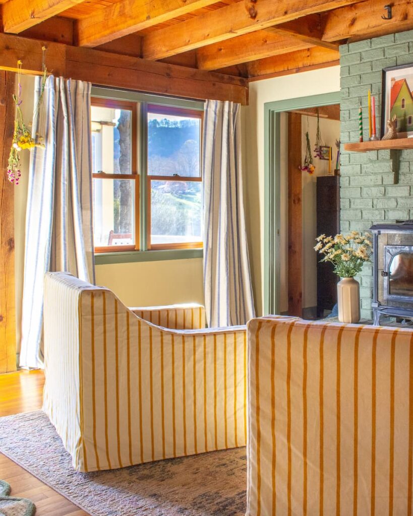
Neutral Walls + Colorful Trim

While I’m a big fan of a bold color drench (where walls, trim, and even ceilings are painted the same hue), I think the safest way to introduce color without it feeling overwhelming is to pair neutral walls with colorful trim.
This approach offers a fantastic balance. Neutral walls provide a calming backdrop and allow the room to feel spacious and airy, while colorful trim adds an unexpected pop of personality.
It’s a great way to add color without committing to an entire room.
If you need a good neutral paint color, my top pick is Farrow & Ball’s School House White. It offers a lovely warm feel, quite different from those starker, cooler whites. As the name suggests, this color is inspired by the shades you’d find in historic schoolhouses.
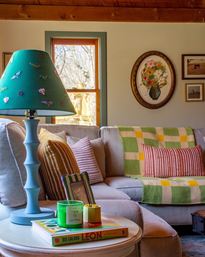
Mix Up Your Colors
To really amp up the interest, consider using your chosen colors in different ways, or in different proportions, from room to room.
Perhaps the trim in your living room uses a lovely green from your palette. Then, in the very next room, that same green might only appear on a small picture frame. This allows you to pull a completely different shade from your palette for the trim.
Unless you want the full ~dopamine decor~ look, don’t feel the need to make everything colorful. Mix in some antiques. Leave some picture frames wooden. An eclectic mix is what we’re after!
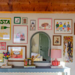
Art & Wall decor
Artwork is a fantastic way to bring in both color and personality. There are so many great ways to add art, whether it’s a large piece that serves as a focal point or small pieces scattered about. I especially like small pieces for styling shelves and bookcases.
Colorful Frames
Frames are the perfect spot to have a little fun with color in your home! My favorite trick is to use small sample pots of Farrow & Ball (no big surprise there, right?) to paint any dull frames I have.
It’s such an easy and effective way to bring your chosen color palette into different areas of your space. Plus, you can use the same sample pot in several different rooms.
A quick note on this: Farrow & Ball’s sample pots contain the actual paint formula, not just a watered-down version. If you’re using a different paint brand, just double-check to make sure their sample paint isn’t just for testing.

Gallery Walls
A gallery wall filled with diverse pieces can add so many interesting layers and colors.
Don’t be afraid to make it personal – maybe include a special plate you inherited from a relative or artwork by a special kid in your life. The unexpected bits are the best!
For more ideas, check out our tips & tricks for creating a gallery wall.
Layers & Layers
And now for the fun part: accessories!
The easiest and least permanent way to introduce color is through accessories, like pillows, lamps and vases. They’re super versatile, meaning you can try things out and swap them as your taste changes – no big commitment needed!
- Pillows: If your goal is truly to add color, lean towards brighter shades! In my own home, I initially went for muted pillows when I first tried adding color. But once I swapped them for some vibrant ones from Muse Textiles, I was amazed at how much life they brought to the space.
- Vases and Greenery: Even if your vase itself is neutral, filling it with vibrant flowers or lush green plants brings life and color into a room. Consider different colored vases to add an extra pop. And yes, if they don’t fit in the color palette– paint them!
- Rugs: An area rug can define a space and introduce a significant amount of color and pattern. Choose a rug with colors from your palette. If you aren’t sure if it will work with the palette, use Canva to build out a mood board. See this article if you need help with that!
- Coffee Table Books: A stack of art books with happy covers on a coffee table or bookshelf can add both intellectual interest and a punch of color.
And finally, here are a few fun finds that would definitely add color and a bit of whimsy to your space!