If I could give you one piece of advice for home updates, it’s this: choose a color palette for your house.
This article, originally from January 2024 and updated in April 2025 (hello, evolving tastes!), details how we chose ours and offers guidance for your own.
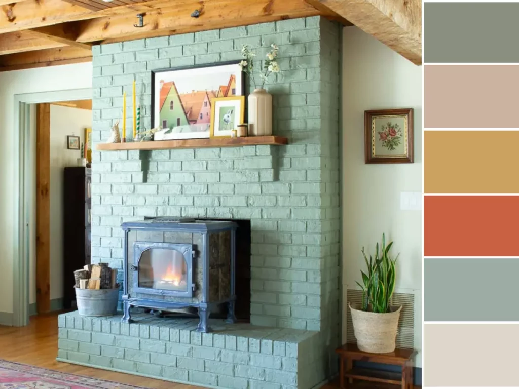
Without a doubt, the best decision I made when updating our house was to pick a color palette. Actually, we have two! Our two palettes are very similar, but the one used in all kid spaces is a bit brighter. Both are detailed below!
First, I’ll share why (and how!) I started to use a color palette.
Why I Decided To Use A Color Palette
I was absolutely overwhelmed with what to do with the house when we moved in. Not only did it need a lot of updating, but there was SO MUCH WOOD to contend with. The floors, the ceilings, the beams! I didn’t know where to start.
I was also stuck in a mindset that the house needed to be somewhat muted– you know, the classic look of the early 2020s that’s very neutral. While the style is absolutely beautiful, I started to feel like I needed to get rid of everything I owned to make a more ‘grown up’ home.
At one point, I realized that the bright colors in my kids’ artwork would clash with the muted greens and greys I was working with. That sounded crazy and didn’t feel very authentic to me– and definitely not the house I wanted to live in.
Inspired By Color
So, there was this moment where I realized color was the missing piece in our home, but then… total blank. Where do you even start?
My main goal was for it to feel like a real family lived here, ya know? And definitely have a spot for all the kids’ bright artwork.
Once “happy” became the design vibe, it took me a while to figure out the actual steps to implement it. But I am happy to share that I did it! And I have tons of advice to share!
How I Started
I started with the Farrow & Ball color card for two reasons 1) their paint is seriously the best, and 2) their color selection isn’t crazy huge like Sherwin Williams. Honestly, having fewer options was a lifesaver for my overthinking tendencies!

Card Room Green
The color I was most drawn to on the color card was Card Room Green. It felt colorful but safe. I knew green would look great with all of the wood around the house, and that I could add a few more ‘fun’ accents to inject a bit more happiness.
Our Home Color Palette
With Card Room Green as my solid base, I started having fun building out the rest of the color story! I hopped into Canva and just started adding other Farrow & Ball colors that were catching my eye.
I thought I’d only pick two or three more, but then it was like, “Ooh, that mustard is perfect!” and “Wait, this pink is gorgeous!” Before I knew it, I had orange and other fun accent colors in the mix, too!
And just like that, I had a palette of six colors that make me so happy.


I use my home color palette to make all design decisions now, whether it’s as small as what color to paint a frame, to a bigger decision like a rug purchase. You can read more about it in my article on why I recommend using a home color palette.
Kid Room Color Palette
We have a separate color scheme for the upstairs of our house. This is where the kids’ rooms are, as well as the playroom. I felt the freedom to be even more creative upstairs because it’s an all-kid area. Though they are all similar colors, the green, yellow, and blue are all a bit brighter than those downstairs.


Our kids’ favorite colors are green and yellow, so I started there and then rounded it out with blue, red and white. The colors are all Farrow & Ball– Breakfast Room Green, Babouche (yellow), Stone Blue, Fruit Fool (pink), Romesco (red) and Schoolhouse White.
Check out our colorful playroom to see the colors in action!
Note: I previously used Farrow & Ball Incarnadine as the red, but swapped it for Romesco when we updated our son’s room. It’s a bit brighter and cheerier!
Other Colors In Our House
There are a few other colors in the house that aren’t in the ‘official’ palette. These are ones I am starting to move away from as I move toward an even more colorful house.

Farrow & Ball Down Pipe
Down Pipe is used on the kitchen island and the entrance to the pantry. It’s a darker color that is described as ‘lead gray’, though it takes on a blueish color in our house. It felt like a good balance with Card Room Green and the fruit wallpaper.

Farrow & Ball Dead Salmon
Another color not on the palette is Dead Salmon. It’s an ‘aged salmon pink’ and takes on a browner, mushroom-like color in some lighting. You can find it on our kitchen range wall and in the dining room. It’s on the walls and ceiling of the dining room!

Farrow & Ball French Gray
French Gray was the entryway color, though we recently swapped it to Card Room Green.

Farrow & Ball Off White
We used Off White for the first set of walls we painted, but switched to School House White for the pantry and the upstairs. Off White is yellower than School House White (and very yellow compared to a true white!) It really works in our home with all of the wood.

Farrow & Ball Green Smoke
The walls and built-ins of our office/guest room are Green Smoke. It’s a beautiful, darker green that is perfect for a study. It’s another one we did early on in the renovation process (and another we may change in the future!)
Advice On Choosing Your Own Home Color Palette
1. Start With One Color
Just focus on one color at first. I am so indecisive and was easily overwhelmed with the options. I could tell that I was gravitating toward Card Room Green, though, and it felt like a great place to start.
If you don’t have a gut feeling, do an inventory of what you currently own. Are your favorite accent pillows a certain color? Do you already have a rug that you want to incorporate?
2. Create A Mood Board
If you are the type of person who can’t visualize what something will look like until it’s done, make a mood board. I myself can’t see things until I can actually see them. I am very visual and have a tough time imagining what something will look like until it’s done. This is a lot easier to do (and undo) with a computer than with a paintbrush.
Pull together a mood board of colors and things you love. Add paint swatches, picture frames, chairs– whatever it is that completes the look for you. I had such an easy time deciding colors once I had them all next to each other. My initial round felt so dark and lacked personality compared to where I ended up.
3. STart Small
If you aren’t sure where to start, try painting something as small as a picture frame. I love buying samples of Farrow & Ball’s paint because they come in tiny paint cans and aren’t sample-grade. It’s their exact paint but in a tiny size.
This is actually how I have added some of the accents to our house– I buy full cans if we are painting walls, but only sample pots if it’s a small project.


This is a great inspiration write up of what you can do..& w/an actual doable starting point or focus.
Direction is always a positive:)👌👏